

Did the SanDisk Logo Redesign Miss the Mark?
Rebranding can be tricky. For a company like SanDisk—a trusted name in flash storage—their logo is more than a visual mark; it’s a promise of reliability. When they rolled out their new logo, it turned heads… but not always for the right reasons. Here’s a breakdown of why this redesign has sparked debate and what lessons business owners can take from it.
The Challenge: Honoring Legacy, Embracing Change
SanDisk’s old logo was simple, clear, and recognizable. The redesign aimed to reflect modernity while retaining the brand’s trusted reputation. But here’s the issue: in the pursuit of innovation, they veered into a space where functionality took a backseat to aesthetics.
Breaking Down the Redesign
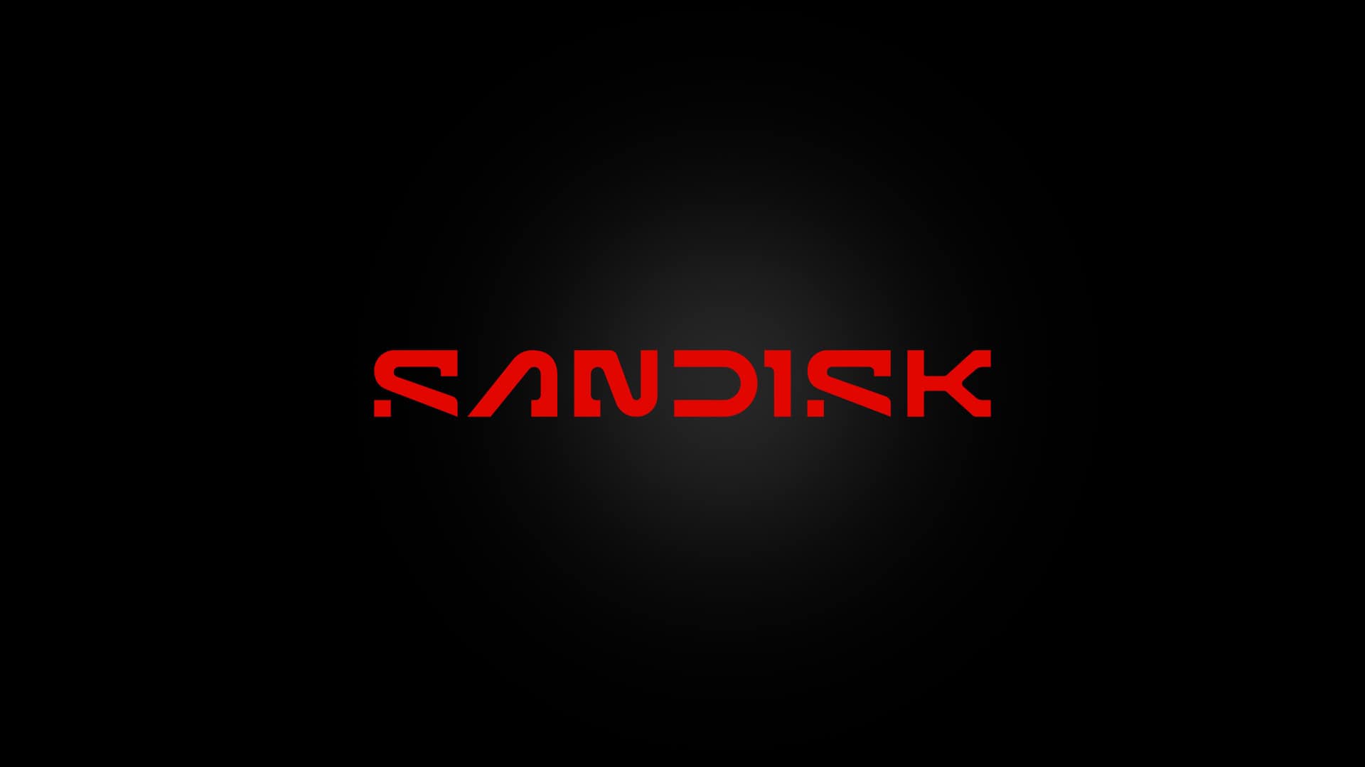
The new logo features a bold, futuristic typeface on a bright red background—a dramatic departure from the past. While ambitious, it brings up some glaring issues:
- Typeface That Overcomplicates Simplicity The angular, geometric letters scream “modern,” but at what cost? Letters like the “N” and “K” are stylized to the point of being hard to read. For a global brand, clarity is non-negotiable.
- The Color Contrast: Aggressively Bold Sticking with the red background anchors it to SanDisk’s identity, but the black typography feels stark and heavy. Instead of approachable, it comes across as intimidating.
- Symbolism That Feels Forced The negative space in the lettering tries to be clever but ends up looking overengineered. A logo should feel effortless, not like it’s trying to impress at every glance.
- Scalability vs. Timelessness Yes, the logo is scalable, but will it stand the test of time? Its edgy aesthetic could feel dated sooner than SanDisk hopes.
Lessons for Business Owners Thinking of a Redesign
- Don’t Sacrifice Readability for Style: If people can’t read your logo, they won’t remember it.
- Keep Your Audience Front and Center: Your brand needs to resonate with the people who matter most—your customers.
- Consider Longevity: Trendy designs are tempting but can age poorly. Build something timeless.
Conclusion
SanDisk’s redesign is bold, but it shows what happens when aesthetics overpower practicality. For business owners planning a logo redesign, this case study is a reminder to strike the right balance between form and function. Want to avoid the same pitfalls? Work with designers who understand your brand’s story and your audience’s needs.
Let’s talk about your next logo. Visit ASTA Agency to learn how thoughtful design can transform your brand!
Explore Branding Services Here.